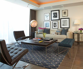
I have asked several friends to e-mail me with their design questions and dilemmas, thinking this would be a great place to start with this blog. All I have to say is I got some really good questions! Thanks people--and please keep them coming!! Today's question comes from my fantastic friend Bessie and I chose it because I think it's something people always struggle with when they want to hang something on their walls.
"I'm hanging photos/pictures on the wall. I want them to all be various sizes, color vs. black white, etc. How do I do this without looking junky?"
Bessie is talking about hanging artwork/photos/etc. salon style. This is when you take several items and hang them in a large grouping. The desired effect is for it to look like it's happened over time, like a collection of life. It makes a great statement and is easy to do. Here are some of my tips for hanging pieces salon style.
1. Salon Style makes a powerful statement so keep it in an isolated area.
2. For best results keep the frame style, color, or material consistent.
3. Change up the content and color of the subjects. Use photos, pieces of art, black & white or color.
** I personally feel like tips #2 & #3 are interchangeable, as long as there is some element of constancy.**
4. Try sketching it out before hand. It makes the actual hanging a lot easier if you already have a general idea of where you want pieces to go. (And of course you are not locked into that sketch--just use it as a guide)
5. Not everything has to be the same shape or size, change it up!
6. If you like it, go for it. In the end you are the one who has to look at it every day!
Designer & Architect: Mark Williams Design Associates
Photographer: Lauren Rubinstein


No comments:
Post a Comment